Newsday – Serenity now: Calming colors to make a splash in ’22

If you’re looking to freshen up your brand in 2022, serene and calming colors may be the ticket to customer appeal, advises a recent report.
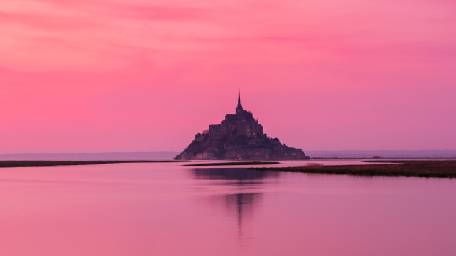
The year 2022’s top trending colors are Calming Coral, Velvet Violet and Pacific Pink, according to Manhattan-based Shutterstock, which studied data and selected the colors based on the images most downloaded by the company’s 2 million customers.
“The report’s based on the most downloaded visual content,” says Flo Lau, creative director at Shutterstock. “It’s a reflection of what’s going on in the world.”
The past couple of years with COVID have been tumultuous and “people are exhausted,” she says. Subsequently, “audiences are looking for something light and calm,” which these colors reflect, Lau says.
Last year’s colors (Set Sail Champagne, Fortuna Gold and Tidewater Green) were more about nature, which reflected people’s desire to be outdoors after lockdowns.
The trend bends this year toward serenity.
Shutterstock describes 2022’s Calming Coral as “a faintly fading peach, like a heavy filter over a beautiful sunset”; Velvet Violet as “a vibrant shade of purple with pink undertones, reminiscent of the lasting luxury and elegance of the royal orchid”; and Pacific Pink, “a cotton candy pink representing a perfect mix of vitality and tranquility.”Get the Biz Briefing newsletter!
Still, while these colors are top trending, it doesn’t mean businesses should suddenly ditch their old brand colors.
“You don’t change your brand color because a certain color is trending, since trending colors are always evolving and changing,” Lau says.
But you might consider softer tones or ones like these for, say, new campaigns or new product launches, she says.
Phillip Davis, president of Tungsten Branding, a Brevard, North Carolina-based naming and branding agency, suggests firms think of their corporate identity colors akin to the exterior of their house and the trending colors as the interior wall colors of your home.
“You wouldn’t repaint your home every year because colors are changing,” he says.
These trending colors might be more for a new product rollout or play into the responsiveness of displays ads and perhaps digital campaigns. Tranquil and serene colors can be a mood indicator. Davis says he’s noticed more softer and gentler colors in campaigns and also matching branding language that evokes stability.
So has Anthony Savino, president of Benjamin Marc, a Lake Grove-based web design, logo design and marketing firm, who said clients are using more “positive and uplifting” taglines and slogans.
He is also seeing more serene colors like corals and velvets in certain industries like medical, spa and health care. But he finds companies don’t always pay attention to the hot trending colors because “trends change so often.”
When deciding on a color, he’ll ask a client what their favorite colors are and try to incorporate that into their brand identity.
If a client isn’t so sure about the color they want, Savino will show them colors off the Pantone Color Wheel, a popular color-matching system.
Season Gorny, owner of Season Winter Inc., a holistic health and fitness coach in Ronkonkoma, who changed her logo and website colors in 2021, says Benjamin Marc showed her an assortment of color examples before she ultimately selected “more of a muted gold earth tone” as her new branding color. Previously her website was very bright with purple and white, she says. Her logo was a gray and white.
The new logo is less busy, simpler and easy to read, and the gold “is a bit more calming and represents more of a natural tone.” she says. “I wanted to take a theme and colors to represent holistic, calmness, serenity and well-being.”
Bill Bohn, president of Huntington-based Summit Graphics Inc., which offers digital and offset print and mailing services, said over the last couple of years, clients have been gravitating more toward softer colors.
“It’s stressful times,” he says, noting green and light blue are popular.
Coincidentally, the Shutterstock report determined, separate from the trending colors. that shades of green dominated in digital click-through rates and conversions. This was surmised by the firm’s subsidiary, Shutterstock.AI, using hundreds of billions of creative data points across years of digital ads.
Bohn said for the most part, smaller firms don’t base their colors on trends or reports. It’s more based on factors like the industry they’re in.
But he said Shutterstock’s findings can be helpful.
“People are always looking to try new things to see if they get a better response from their campaigns,” Bohn says.
Fast Fact:
How important is color? Nearly 40% of consumers appreciate colors the most among visual elements on business websites, according to a survey released this past summer by Top Design Firms.